As a part of enhancing the advertiser’s ad targeting experience, Instagram had come up with the call to action buttons on the platform in 2015. These buttons sought to solve one or many of the advertiser’s objectives (brand awareness, message proliferation, or revenue generation). Under this change, users could carry out specific actions directly from within the app. These actions ranged from visiting a website to purchasing the product or installing an app.
Instagram had added the CTA bar which ran through the entire length of the photo’s bottom area. This was done mostly to assuage the advertisers’ fear that more people were not aware of the CTA button option. So it made the clickable element prominent by placing it at the bottom of the video or the photo. It ran the entire length of the bottom of the picture or the video.
What has changed in October 2017?
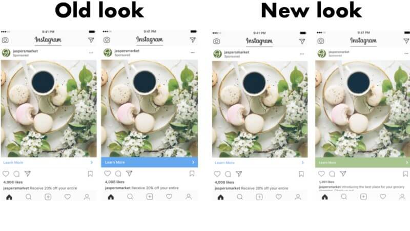
Some days back, Instagram has introduced a small change to its call to action bar. While the previous default colour for the CTA button was blue, now there will be a slight albeit interesting update – the colour of the tab/button will now change dynamically to reflect the majority shade of the content posted on the social media channel.
For example, if it is a picture of a predominantly green background, the button colour too would change to green. To better blend with the colour of the content of the sponsored posts, Instagram has taken this new step.
The rationale behind this change
This is one of the most significant changes Instagram has done to its clickable ads to help advertisers boost ad revenues and drive their engagement goals towards successful accomplishment. Instagram is updating the CTA bar to better blend in with the content.
A few months back, due to the constant demand of the advertisers, Instagram had made its sponsored ads click to element more prominent by changing the bar colour from white to blue after 4 seconds. Now the blue colour of the bar will dynamically adjust to the prominent colour of the ad’s photo or video.
Potential advantages of this change
- Seamless blended look
By making the ad’s photo or video its standout element, the redesigned look has also made it possible that the people’s feeds look more natural and seamless blended in with the image overall. This way Instagram can pump in more ads into people’s feeds. Also due to this new feature, the feeds don’t look bloated or overloaded with ads.
- Natural complement to the image
Previously people would know that a post is sponsored through the blue call to action bar at the bottom of the screen although it would take at least four seconds for the bar to turn blue from white. By complementing the colour of the ad with the prominent colour of the photo, the CTA bar feels more like a part of the picture. This way people won’t be able to know the difference between the ad and the photo or video as they hurriedly swipe through their feeds.
This can prove to be a masterstroke from Instagram as it can help to sharply increase the revenues and decrease the load on its parent company Facebook. Stay tuned as we explore this situation in-depth in the coming days.