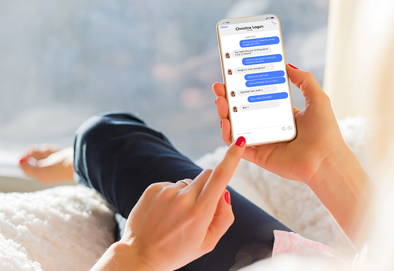
Those who use Facebook’s messenger service would support the fact that the application is riddled with features that one can easily do without. In an attempt to keep the layout cleaner, Facebook has launched a cleaner version of the messenger app.
The Messenger redesign didn’t happen overnight. The social media behemoth had given a sneak peek of this change in its annual F8 conference held in May 2018. The change tackles three key areas
– Take out some of the unnecessary interface elements
– Put more focus on commonly used features that users want to get to in quick time
– Simplify the overall experience the user receives
In addition, it has now put an additional ‘dark’ option for variety in interface appearance.
While there was no official notification of how the sneak peek of May 2018 would transpire into the user devices till now, but now we see many reports coming in of users viewing the new display on the Messenger app. This shows that Facebook is rolling out the changes, starting with a handful of beta users.
Some of the changes reported are as below –
1 – Interface level
At the interface level, we found the new appearance to be a tad jaded. Though it looks fresh from FB point of view, if we compare it to revamped applications like Skype chat, we can see that a lot of companies have already done this keeping in mind that a lot of chat activity now happens on the limited screen real estate of the mobile.
2 – Looks
The new look does help users who prefer an uncluttered layout or work with just a handful of the multiple functions available. They have done away with unnecessary lines, thus making the entire layout seamless. This goes very well with Google material design emphasis. Though some may feel that the all-white outlook may hinder the overall appeal of the screens. A good point though is the availability of the ‘dark’ mode for chatting at night.
3 – Bottom bar
Some radical changes have occurred in the bottom bar. It now houses just three icons. The camera button is missing here. But if we look closely we will see that the camera icon is now shifted from the bottom bar to the top right space. Same is the case with the ‘New Chat’ icon.
The app surely looks a lot different from its previous avatar. It also syncs with the overall business philosophy of Facebook to simplify the user experience around the app. Initial responses from the beta launch too look encouraging. However, what will be the responses coming in after a full-fledged launch? That is a question only time can answer.
What are your thoughts about these changes done on the Facebook Messenger interface? What points would you like to keep and what features would you like to do away with from the new interface? Do write to us and let us know.