
With trends revealing increasing browsing activities through mobile phones especially smartphones and tablets, it becomes inevitable to have websites which are easily accessible with the mobile platform and interface. Digital marketing experts strongly believe that internet traffic through mobile is going to increase manifold. For quite some time now, SEO experts have been advising clients a dedicated mobile site to capture the incoming traffic while being search engine friendly too. Hence, it makes sense to invest in online products and channels wherein the purpose of attracting traffic online is solved and to a great extent attracts conversions too.
Though for some, this predication is skeptical but likely to be quite accurate. There have been arguments stating the mobile technology is new and customers are likely to take time to adjust. Conceding the fact that many established online portals have proceeded to offer the same to their customers/visitors, it is time online businesses do give it a serious thought.
In fact, Google has recorded increasing number of visitors making purchases through their smart phones along with the fact that more than three quarters of the online visitors made a purchase online. Emphasizing on the undertones that despite the presence of the desktop, users found accessing the sites through their mobiles/smart phones easier and much more convenient which does relate to gearing up new strategies and developments. It’s time ecommerce retailers sit up and adapt to this trend as soon as they can.
Trends reveal that users prefer to access information, shopping deals, reviews and other related information through their in hand mobile devices especially when they are on the move and about. Consider it as an activity which keeps them engaged or provides them with vital information at their fingertips, a time saving activity
Thinking of proceeding with the development of a mobile site? Well, the most popular options are either you have an entirely different site to cater to mobile visitors or you could develop a mirror image of the website which is smaller than the desktop site or an entirely different site. On the overall, make sure you have site which serves the purpose of your mobile visitors and is quite responsive too.
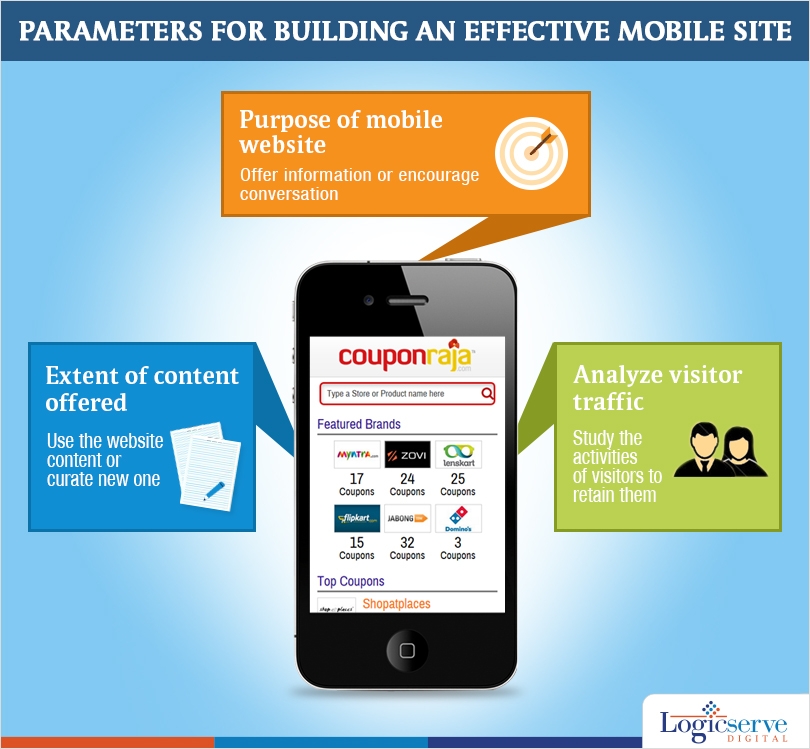
Whilst planning a mobile website, website owners need to analyze and arrive upon the following parameters –
- Goal of mobile website – offer information or encourage conversions
- Extent of content offered – use the same content or have a different content
- Analyze Visitor Traffic – study the activities of visitors on mobile website before proceeding
From the SEO perspective, having an entirely different site catering to queries and requirements through mobile phones works in a great way rather than slightly tweaking an existing desktop site to suit mobile traffic.
Responsive Sites
Since both the sites, desktop as well as mobile are pretty identical, owners will need to update a single set of content. Bear in mind, content will be viewed on a smaller screen when accessed through a mobile as against the large screen of the desktop PC. In fact, by offering more compatibility these websites are known to perform much better. They could even build up responsive sites bit by bit and study its performance in a similar pattern. This helps you make it even more responsive as per the traffic analytic reports.
The other alternative is to make a separate but an identical site with same URLs for mobile use but make sure the site is dynamically served on to the mobile devices when accessed. This means the issue related to broken URLs is taken care of.
Many a times, visitors could be complaining of content loading issues on the mobile device but then it pays to have concise content which does reduces the loading time too. Images are dynamically served as per the screen size of the mobile device which makes things even more convenient. Use of simplified Java Script or switching over to HTML 5 is advisable as it helps the website to function in a better manner.
Separate mobile sites
Separate sites do have a definite edge over responsive sites for they can tailor made to cater to specific requirements of mobile visitors. This means they can be very different and tweaked to include keywords while adapting to mobile search engine parameters. The main desktop site is left untouched while developing a new mobile site offers the much required flexibility to innovate and try out new ideas too. Don’t miss out this opportunity to be creative to the best of abilities and try them on an entirely new platform.
For survival of any business, online or offline, being dynamic is essential. Hence, adapting to new environments such as mobile platforms becomes the need of the hour. By launching a mobile website parallel to the desktop site, visitors and relevant traffic is taken care of to a great extent.
LogicSpeak:
The number of users accessing the web on their mobile devices has dramatically increased. This is because of the availability of more affordable smartphones in the market. Mobile devices are no longer just for basic texting and calling. They are used almost the same way as computers. This is the reason why mobile websites are vital for businesses that would like to build their presence online.


