There have been instances of websites receiving mails from Google and notifications through Webmaster Tools stating that they have to become mobile friendly if they wish to perform well on the mobile platform. At the same time, this hints at mobile ranking which could affect their site visibility in the near future. It is very much possible that Google may be launching a mobile ranking algorithm soon wishes to get as many as sites mobile friendly by the time it is actually launched.
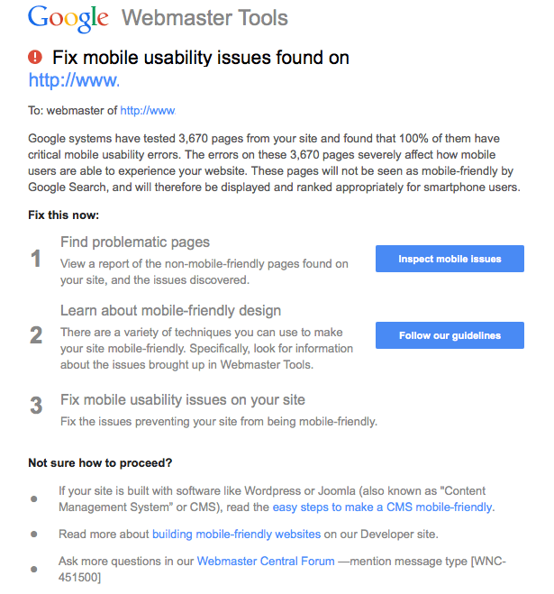
Since last November, Google has gone ahead and launched mobile friendly testing tool, mobile usability reports in Google Webmaster tools including mobile friendly labels in search results.
Getting on the basics of Mobile Usability
As a preferred search engine, Google is committed to display not only useful but accurate information to the search queries. The emerging preference for search through mobile phones especially the smartphones highlights the need for websites to adapt to the mobile interface as soon as they can.
Apart from being affected by likely to be launched Google Mobile Ranking algorithm, websites may face visibility issues in the mobile platform soon, if they do not adapt to it soon. Websites can access the mobile usability report offered under the Search Traffic section which identifies the errors page wise of your website assisting you to resolve them in the right manner.
Key Adaptations required include –
Defining a viewing area a.k.a viewport – The pages of your website need to define the meta viewport tag which directs the browser to adjust the web page’s dimension as per the device screen through which it is being accessed. This is important as there is vast range of devices through which websites can be accessed.
Content flow visible in the viewport – If this point is highlighted in your report then you should define a relative width and position values for CSS images, including images which ensures that the web pages are displayed through a horizontal scroll for a better display.
Suitable Fonts and their size – A mention of this point in the report suggests on which pages you need to make changes in the font size ensuring their readability. Once done, the viewers will no longer require to ‘pinch and zoom’ content for reading the web pages. Remember to specify the viewport which could solve the scaling of the font size just perfectly.
Well defined and spaced out Touch Elements – The touch elements offering further entry into the websites should be well spaced and kept in the eye view which ensures their visibility and use too. If at all, this point gets highlighted in the mobile usability report than you need to pay attention to suggested URLs wherein the space buttons, touch elements along with the navigational links are well spaced and placed for further use.


