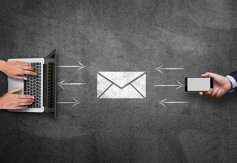
It’s no surprise that in 2019, the time spent on mobile devices has increased significantly as compared to desktops and laptops. As a business owner, if you aren’t convinced yet of mobile-friendly email design, here are some compelling statistics to persuade you.
- The global Email Benchmark Report of 2018 reveals that nearly 56% of all emails are now accessed through the mobile device.
- A study by Deloitte states that an average mobile user checks his/her phone 47 times in a single day. The number jumps even higher to 75, for people between the ages 18 to 24.
- Another study by Dscout reveals that smartphone users interact (clicks, swipes, taps, type, etc.) with their mobile devices 2617 times a day! That’s a massive amount of screen time.
It’s no surprise that mobile-first is no longer an option but a mandatory choice. What more, businesses that don’t adopt a mobile-friendly design don’t just miss out on sales, but lose out on valuable customers. A market study conducted by Litmus and Fluent revealed that nearly 45% of customers unsubscribe from promotional emails if the emails don’t display properly on their smartphone. And, once a user is gone, it’s a huge challenge to get them to re-subscribe.
Now, that you’ve understood the critical importance of keeping your emails mobile-friendly, here are some best practices to follow.
1. Keep the Mails Short
102 – This number should be engraved in your mind. If an email is more than 102kb, then Gmail will clip it and ask users to download the rest. Users are unlikely to read a message that isn’t downloaded in full. They would consider it as spam, broken or simply delete it.
Mobile browsing is all about convenience and speed. When you make users take an extra step, they are likely to feel annoyed. Thus, keep your emails light and crisp.
2. Single Column Triumphs
Single column layouts are the best ways to present content for mobile devices. When you use more than a single column, users will have to adjust their screen settings to read the mail completely. As mentioned above, this needs users to put in extra efforts.
Also, remember that most readers browse emails on the go – while commuting to work, walking to lunch, etc. When you use single columns, it’s easy for readers to browse emails single-handedly using their thumbs alone, thereby increasing potential engagement.
3. Remember you are Aiming for Taps and Not Clicks
While this is obvious, most email designers miss out on this crucial element. While designing CTA buttons, make sure that it has sufficient space to make it easy for users to tap on it. Avoid placing several options right next to each other. Provide some breathing room for users to avoid frustration, and avoid tapping on wrong links.
4. Time your Emails Right
A general rule of thumb to follow here is – make sure your emails follow the sun. Instead of sending your emails at the same time to all your recipients, schedule emails according to varying time zones.
You don’t want your users to be woken up by the annoying buzz of an incoming email. Also, you don’t want your emails to get lost in inboxes, by the time your user checks their mail. Track data to find the best time to send emails and schedule emails accordingly.
5. Enlarge Fonts and Make CTA Prominent
Small text that can be read on desktops is not easily read on tiny mobile screens. Hence, ensure that you use fonts larger than that you use for traditional fonts. Another trick here is to highlight the key parts of the message with larger fonts to help capture user attention.
Finally, you want your readers to take certain action after reading your emails. So, make sure to keep CTAs prominent. Use large, thumb-tappable buttons that are easy to spot and easy to tap on.
The Future is Mobile
The recent announcement of AMP for emails from Google has got digital marketers excited. The AMP offers rich features and enriching experiences for the inbox. Right now, Gmail is the only inbox where users can receive AMP messages, with interactive experiences. However, it’s sure to come to other inboxes in the next few months.
The future is mobile, and it’s getting interactive. Mobile email designers should up their game to stand out.


