These days a mobile phone is the principal source for experiencing the internet. So it’s crucial for the establishments which promote their products online, to build a mobile-friendly website. As if you fail to build one then surely you lose a buyer with each search on internet through mobile devices. The experience phone operators would have on your site is way too different from the desktop version, which means it would cause completely different problems which the internet masters need to pay attention on. Thus here are few tips to start with for you to build your site as a mobile-friendly site.
- You should check if your site is a mobile friendly site by using Google “Mobile-friendly test” which would also display the way it appears on devices. This way you would also get aware of elements which can’t be loaded. So this is a kick start to build a mobile integrated site.
- Then comes designing the pages, you should ensure that all the most important elements which you want to make visible to the users need to appear at the top section. As a buyer won’t spend time scrolling down the bulk pages. Also the design of the page should be calculated to ensure that it fit into the screen size. Here you need to note few important aspects to enhance the designing such as using compact and small size images for quick loading, using keywords for description to make it crisp, adding icons such as ‘add to wish list’, ‘buy now’, ‘add to cart’, ‘search option’, etc. and to use product page to show all the required information such as delivery details, dimensions and other specifics.
For instance, Amazons mobile site includes all these items displayed.

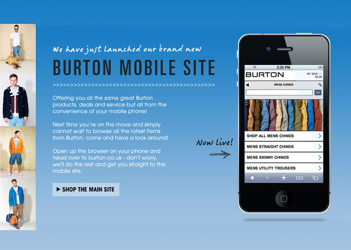
- Verify your content to confirm what’s workable in your site on mobile devices or not. Presuming that every matter would be operational is wrong to assume. So videos need to be checked especially as few videos are jammed from replay or use formats not accepted on mobile devices. Similarly many images and matter are also blocked for not being in the required format so it’s mandatory to scrutinize all the content. Burton and Dadaab stories are two mobile sites which share a lot of content wisely. In the case of Burton, despite all the images and videos which work well, the speed is uninterrupted with the amount of matter shared.
- It is a controversial topic to decide whether ads need to pop up before the content on the main page is made visible. Generally sites in which ad pop ups leads the customer to the site’s mobile app are not considered appropriate. As the customer doesn’t appreciate such sites with ad’s and app requests. So you could be patient enough and include such tags in the upper section of your page. Also redirecting to your mobile site from Google or desktop site ensures the programming is correct and doesn’t lead the buyer to various other non-significant pages. This might make the customer loose interest due to confusion. Another thing is to ensure that the back links from your site should take the customer to appropriate pages. 404 pages should also be avoided for mobile-sites. IFC showcases plentiful of information through its page in an organized manner. It links you to pages further which are associated to its series directly. This efficiency needs to be hence maintained.
- Most important is to know that resolution of the mobile site varies drastically in comparison to the desktop site. So for mobile site’s you could use this advantage and put up a site with less heavy and compact content which works even in the sluggish and untrustworthy internet connections.
Nixon and salesforce belong to the category of such mobile sites which not only are responsive but load with fast speed.

- You should also enhance your Google local webpage for your mobile site to make local exploration more exact and unambiguous. To do so submit your contact details and in particular your contact number and also include customer reviews on the page. The global ecommerce sites should chiefly work on their local sites and the way the content is shown locally.
LogicSpeak:
Make your ecommerce site a fully responsive mobile friendly site. In this era of portable gadgets, a superlative mobile search performance will make you soar higher towards success.


