Twitter Moments is all set to get a refreshing new look. The company is currently trying to move away from the horizontal listings of curated topics on common themes like Sports, Entertainment, and News. Ever since its release in October 2015, the section has been portrayed as a mainstay of the popular social network. This has also been a key reason why many non-users have wanted to sign up to the platform.
However, over the years, the tab has done little to explain its prime positioning in Twitter’s scheme of things. In a recent move to bolster its declining popularity, Twitter is looking to experiment with the way it is being displayed on the screen. While its current avatar shows Moments listing all the trending stories in a vertical order, the company is seeking to change this.
What has changed now?
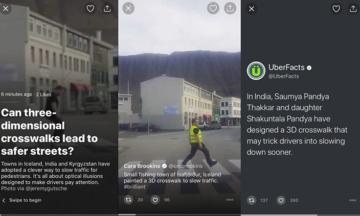
Twitter is now working on a horizontal presentation format and discard its current vertical presentation and add a touch of freshness to the module. So, while the present horizontal form covers the entire screen with an enlarged image that takes up the background of the app, the vertical positioning will be slightly different. It will be in the form of a regular tweet that users can scroll vertically to move from one post to another.

The changes are applicable to both Android and iOS. For iOS, the first tweet is still in the form of an enlarged picture (as we currently see) and the next set changes in the form of regular tweets. On the Android, the presentation is with a slight tweak. Here, you will see only one tweet at a time. While the company has not clarified the need for different presentation formats for the two dominant mobile OS, the look is still refreshing enough and worth a look.
Why the need for this change?
As mentioned, the Moments module had lost some of its popularity over the years, and the brains behind Twitter feel that its current look has something to do with this decline in popularity. Hence it is experimenting with the new look. They also think that this type of presentation will be in sync with the overall Twitter experience. While the presentation format looks different, the way content is curated (around a specific point of interest of a single theme) is still the same.
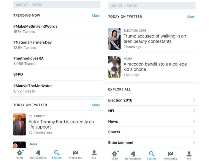
The change might be significant as it may seek to enhance the overall user experience. For Twitter users, this will be more in line with their regular content consumption habit on the usual Twitter feed. This move comes some months after it sought to have a replacement solution to Moments in the form of ‘Explore’ tab that too did the same thing as Moments – i.e. highlight the trending videos and posts around particular topics.
Will anything change?
Moments was launched to counter Snapchat’s vertical presentation format. Over time, however, Twitter figured out that Twitter users do not expect the same behaviour that they experience on Snapchat. With this move, it seeks to augment the overall user experience that is unique to the Twitter platform. How well it is embraced by the users, is a matter yet to be seen after its beta launch.